Navigation: Getting Started/Overview > Data Properties & Grouping |
A grid component enables you to view and edit records from a table in a tabular grid format, also known as rows and columns. Generally a grid is associated with a Data Navigator. The following is a sample Cost Centers grid from the Administration Module.
Arranging Columns (Grid Properties)
The easiest way to arrange grid columns is to left click on the column heading and drag the column to the desired position. However, you can also click on the Grid Properties ![]() button in the upper left corner of the Grid to select which header you want displayed in the table.
button in the upper left corner of the Grid to select which header you want displayed in the table.
the order, width and column titles.

• Sorting - The ability to sort (Ascending or Descending) by one or more columns.
• Grouping - The ability group the grid data in a tree format by one or more columns.
• Column Arranging - Arranging column order and enabling / disabling columns for display.
• Footers - Adding a summary footer at the bottom of a grid to include sums, averages, etc.
Column Sorting
![]() Click on any column heading to sort the data by that column. The first click will sort by that column in ascending order. A second click will sort the data by that column in descending order. To sort by more than one column, press and hold the Shift key and click addition column headings
Click on any column heading to sort the data by that column. The first click will sort by that column in ascending order. A second click will sort the data by that column in descending order. To sort by more than one column, press and hold the Shift key and click addition column headings
Grouping Records
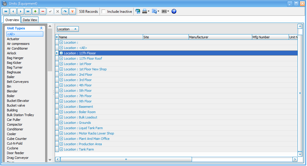
Grouping - You can group the grid data by one or more columns by simply clicking on a column heading and dragging the heading to the group box panel. This causes the data to be displayed in a tree type format with the ability to open and close groups as shown below.
In the image below you see where the group search is by "Location". Use the ![]() to maximize your the location group.
to maximize your the location group.

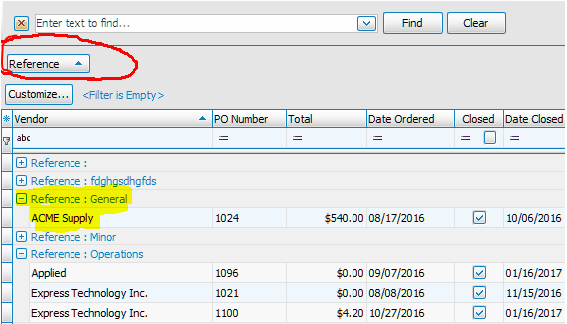
Reference column header was dragged and dropped in the Group panel, causing the grid data to be instantly grouped by the Reference field. Notice the data is now listed under Reference field group headers. You can then click on the ![]() left of the Reference to open or close each section.
left of the Reference to open or close each section.

Sub-Grouping Records
Sub-Grouping - To group by more than one column, simply drag a second or third column header to the group panel.
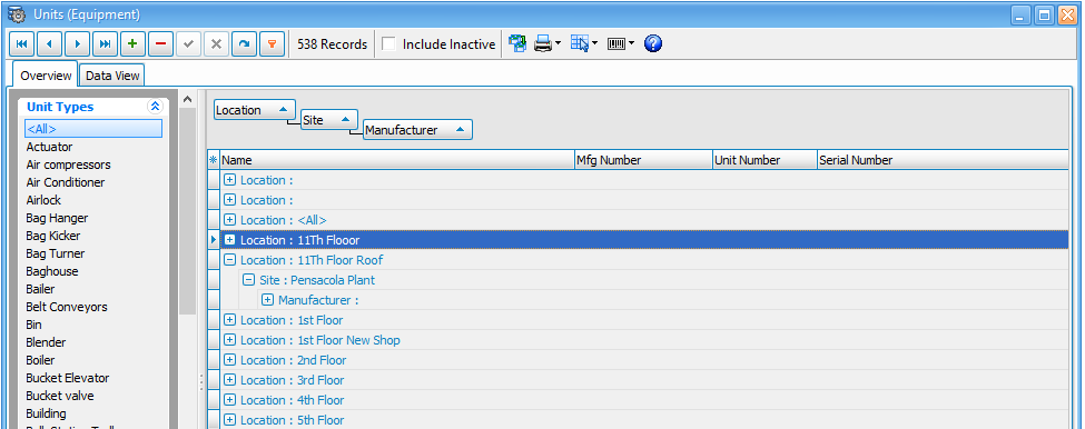
Below is an example of sub-group the data. Again the initial group is "Location". The sub-groups are "Site" and then "Manufacturer".

UnGroup Records
To ungroup, click and drag the column header from the group panel back down into the grid header in the location desired.
Right Click the group by box:
Expand and Collapse - This will change the view of your group list.
Clear Grouping - To clear your entire group search select clear grouping.
Hide Group by Box - Select hide to minimize the group by box. Note: To maximize the group by box simply right click a header and select "Group by Box".
Arranging Columns
Click on the small button in the top left corner of any grid and a window will appear listing the available columns for that grid. You can then arrange the columns as desired as well as turn them on and off by checking / unchecking beside the column name.
You can also re-arrange columns by using the mouse and moving the headers around on the grid. To remove a column from display, click on the header and drag it off the grid all together. To restore a column back in the grid, click the button in the top left corner and then check beside the desired column to have it appear.
Columns can also be sized by using the mouse and clicking on the right or left side of the column heading and expanding its width.
Additional Information
However you design your grid, ExpressMaintenance will remember your grid settings for the next time you open the screen.
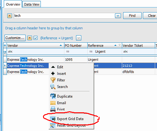
Each grid includes a popup menu accessible by right clicking in the grid on the data rows. Below is an example of the popup menu.
There are several quick click options including the option to Export the Grid Data. This means you can use the Find and Filter features to zoom in on the records you need and then export the to Excel.

Footers
You can apply a footer to any grid by right clicking on any column header and selecting the Footer option. This will turn on the grid footer.
Then right click in the footer below the desired column and select the type of information you want displayed in the footer.
There are several options depending on the type of data in the column.
For example, you can choose from Count, Sum, Minimum, Maximum and Average.

Inserting & Editing Records
In addition to using the Data Navigator, the following key strokes perform special tasks within a grid.
CTRL-DEL--deletes the current record.
ESC -- cancels all edits for a record.
INSERT -- Inserts a new empty record.
A grid field may also automatically display a combo box drop-down button when a cell of that column is in edit mode. The drop-down list is populated with lookup values defined in a setup screen.
A grid field can also display a pick list that looks and operates like a lookup list column, except that the column's field is a normal field and the drop-down list is populated with a list of fixed values defined at design time instead of lookup table values defined by the user in a setup screen.
When a user edits a record in the grid, changes to each field are not posted to the table until the user moves to a different record in the grid or clicks the post button. When a record is posted, if there is a problem updating any fields that contain modified data, an error occurs and the data is not modified.